Cluster, heatmap
Introduction
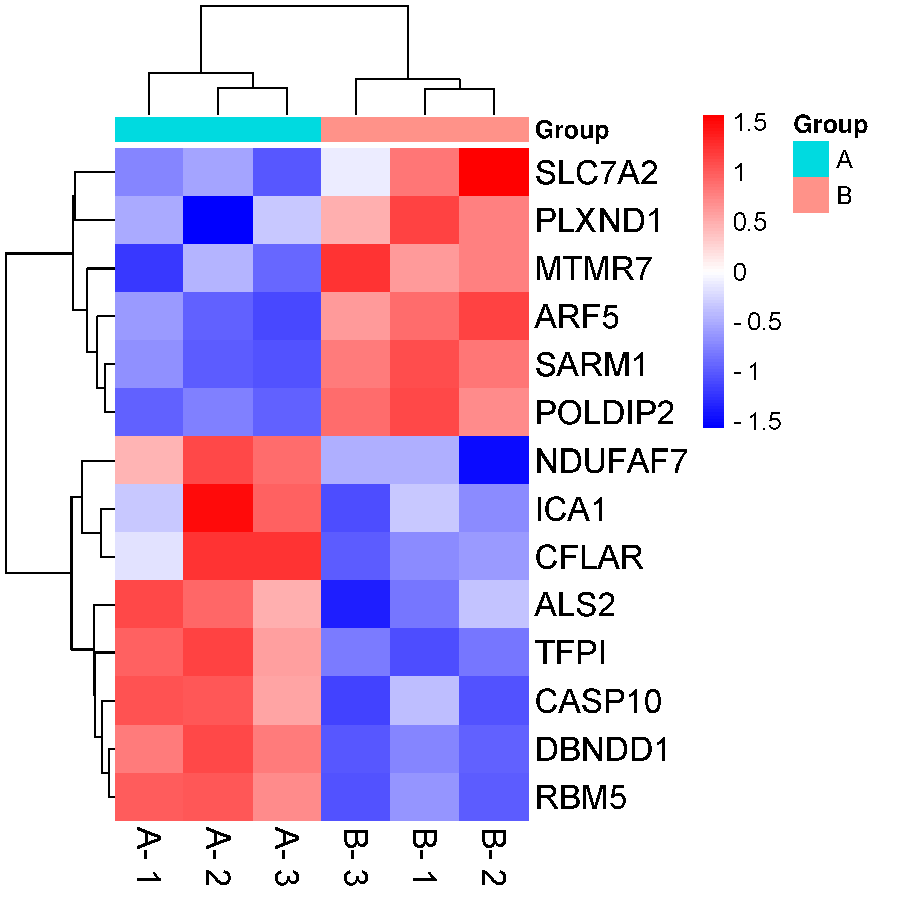
A heat map is a well-received approach to illustrate gene expression data. It is an impressive visual exhibit that addresses explosive amounts of NGS data. It’s packed with closely set patches in shades of colors, pomping the gene expression data of multifarious high-throughput tryouts. Reference: pheatmap R package.
Input data instructions
Matrix input data. The first row is group names. The second row is sample names. The rest rows are values of each gene in each sample.
note: 1, if genes are not unique, mean values will be used. 2, Samples must unique. 3, Values of a row must NOT be the same (remove these rows before you plot).
If your data contain only 0s and 1s, just use two colors (same middle and higher colors).
Paper example
Integrated network analysis to explore the key genes regulated by parathyroid hormone receptor 1 in osteosarcoma Fig 1.
1) How to plot?
1, Put data in excel according to the example format.
2, Copy and paste into input frame.
3, Input pre-checking button to check input
4, After checking pass, select parameters, submit and download
2) How to cite?
3000+ papers in (Google Scholar)
Tang D, Chen M, Huang X, Zhang G, Zeng L, Zhang G, Wu S, Wang Y. SRplot: A free online platform for data visualization and graphing. PLoS One. 2023 Nov 9;18(11):e0294236. doi: 10.1371/journal.pone.0294236. PMID: 37943830.
3) FAQs