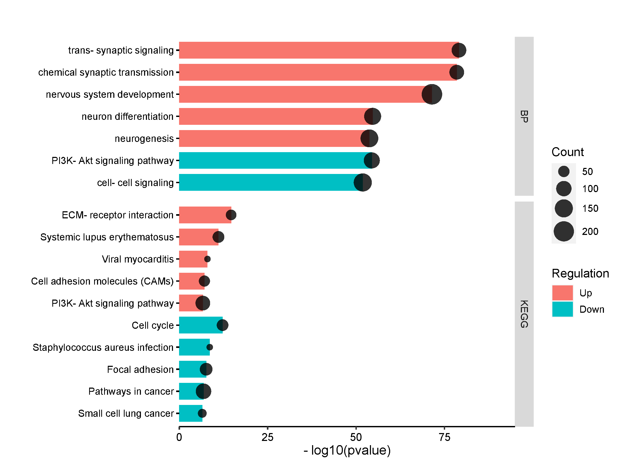
GO, KEGG Enrichment dot line
Introduction
This figure was components with lines and dots. Line lengths represent p; dot represent gene number. Used for multi categories: 1, only GO results (BP,CC,MF); 2: BP, KEGG; 3: BP,CC,MF,KEGG
Input data instructions
The first column is Term name; the second column is Category; the third column is Count; the fourth column is Pvalue, the fifth column is Regulation (must be Up or Down).
Paper example
Hepatic transcriptome perturbations in dairy cows fed different forage resources. Fig3
Writing references
Significantly enriched Gene Ontology Biological Process and KEGG pathways revealed by ClusterProfiler analysis of the genes up- (in red shade in the figure) or down- (in blue shade in the figure) regulated in treatment samples compared to control samples. In vertical axis is the terms, in horizonal axis is the -log10(pvalue).
1) How to plot?
1, Put data in excel according to the example format.
2, Copy and paste into input frame.
3, Input pre-checking button to check input
4, After checking pass, select parameters, submit and download
2) How to cite?
9000+ papers in (Google Scholar)
Tang D, Chen M, Huang X, Zhang G, Zeng L, Zhang G, Wu S, Wang Y. SRplot: A free online platform for data visualization and graphing. PLoS One. 2023 Nov 9;18(11):e0294236. doi: 10.1371/journal.pone.0294236. PMID: 37943830.
3) FAQs