Read before use
1, data from excel, copy and paste data into the input frame
2, data from txt, must tab-seperated, copy and paste data into the input frame
3, specieal and non-English characters such as #, <, >, %, (, ), α are not friendly
4, use point as decimal separator, not comma. e.g. 3.14, not 3,14 as pi
Import a saved JSON file to restore your settings
Required

Optional
If value is large, square root transform. For epidemic data, transform by default


text fontsize:
distance of text to bar:
central circle size:

Colors


color 1:
color 2:
color 3:
color 4:
color 5:
color 6:
color 7:
color 8:

Direction


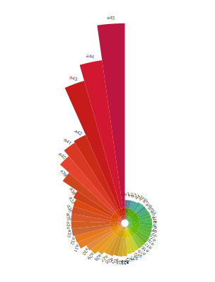
polar bar plot

Introduction
Polar bar plot. Edit the names by yourself.
Input data instructions
Input data contain two columns: the first column is name, and the second column is the corresponding values.
Paper example
Coronavirus (COVID-19) map.
Input Example
Output

1) How to plot?
1, Put data in excel according to the example format.
2, Copy and paste into input frame.
3, Input pre-checking button to check input
4, After checking pass, select parameters, submit and download

2) How to cite?
10000+ papers in (Google Scholar)
Tang D, Chen M, Huang X, Zhang G, Zeng L, Zhang G, Wu S, Wang Y. SRplot: A free online platform for data visualization and graphing. PLoS One. 2023 Nov 9;18(11):e0294236. doi: 10.1371/journal.pone.0294236. PMID: 37943830.

3) FAQs