核密度估计(Kernel density estimation)
简介
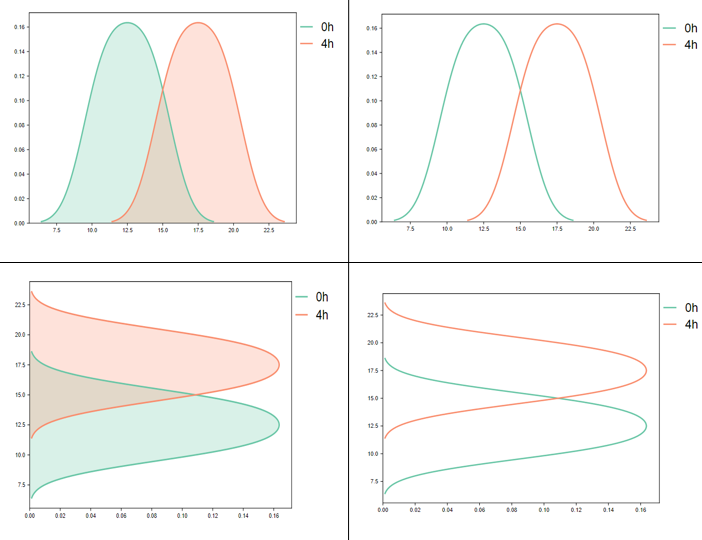
密度图是基于核密度估计的一种图形表示方法,它将估计的密度函数绘制成图形,通常表现为平滑的曲线或曲面。密度图可以显示数据的分布形状、多峰性、偏态等特征。密度图是探索性数据分析中的重要工具,它提供了一种直观的方式来观察数据的分布特性。调用seaborn
数据说明
第1列为蛋白质名字,第2列为蛋白质信号强度(log2转化过)。也可以绘制多列。
论文例子
CCL19-producing fibroblasts promote tertiary lymphoid structure formation enhancing anti-tumor IgG response in colorectal cancer liver metastasis Fig1 C
如何引用?
建议直接写网址。助力10000+篇
(google学术),9000+篇
(知网)论文
正式引用:Tang D, Chen M, Huang X, Zhang G, Zeng L, Zhang G, Wu S, Wang Y.
SRplot: A free online platform for data visualization and graphing. PLoS One. 2023 Nov 9;18(11):e0294236. doi: 10.1371/journal.pone.0294236. PMID: 37943830.
方法章节:Heatmap was plotted by https://www.bioinformatics.com.cn (last accessed on May 4, 2026), an online platform for data analysis and visualization.
致谢章节:We thank Mingjie Chen (Shanghai NewCore Biotechnology Co., Ltd.) for providing data analysis and visualization support.