motif logo
简介
序列motif,通常指的是在生物序列分析中,特别是DNA、RNA或蛋白质序列中,出现的一段具有特定功能或结构特征的短序列。这些motif可以是进化上保守的,也可以是具有特定生物学意义的模式。序列motif的识别对于理解基因的调控、蛋白质的功能以及生物分子的相互作用至关重要。
在DNA序列中,motif可能代表转录因子结合位点,这些位点是转录因子识别并结合到DNA上以调控基因表达的特定序列。DNA序列motif的识别可以帮助研究者了解基因调控网络。
RNA序列中的motif可能与RNA的二级结构或三级结构有关,这些结构对RNA的功能至关重要。例如,miRNA的前体序列中就包含特定的motif,这些motif对于miRNA的成熟和功能至关重要。
蛋白质序列中的motif通常指的是蛋白质结构域或蛋白质家族中的保守序列。这些motif可能与蛋白质的特定功能或其与其他分子的相互作用有关。例如,锌指结构域就是一种常见的蛋白质motif,它允许蛋白质与DNA结合。
数据说明
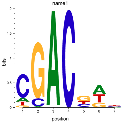
输入为fasta格式。第一行是大于号+名字,每行的第一列是碱基或者氨基酸,后边的数字表示该位点碱基或者氨基酸的频率。列数对应序列长度。调用motifStack R包
论文例子
motifStack for the analysis of transcription factor binding site evolution
如何引用?
建议直接写网址。助力10000+篇
(google学术),9000+篇
(知网)论文
正式引用:Tang D, Chen M, Huang X, Zhang G, Zeng L, Zhang G, Wu S, Wang Y.
SRplot: A free online platform for data visualization and graphing. PLoS One. 2023 Nov 9;18(11):e0294236. doi: 10.1371/journal.pone.0294236. PMID: 37943830.
方法章节:Heatmap was plotted by https://www.bioinformatics.com.cn (last accessed on May 4, 2026), an online platform for data analysis and visualization.
致谢章节:We thank Mingjie Chen (Shanghai NewCore Biotechnology Co., Ltd.) for providing data analysis and visualization support.