两组学联合分析bar+dot图
简介
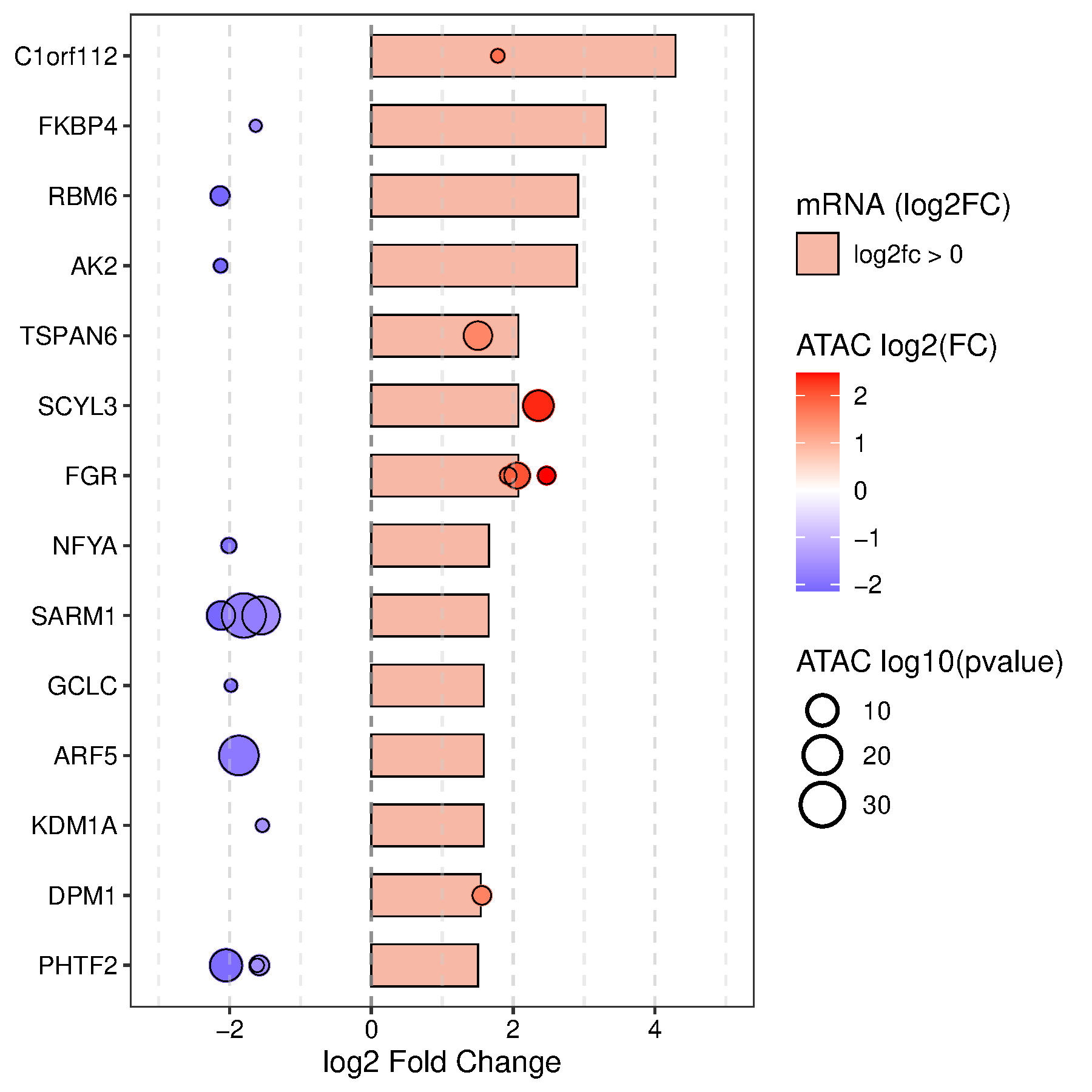
使用bar和dot展示两种组学的合并分析结果。X轴是log2fc,Y轴是基因。bar表示基因对应的转录组表达的差异log2fc,点表示基因对应的表观组ATAC peaks的log2fc和-log10(p)。每个基因可以对应多个peak,直观展示了基因/peak在两种组学中的差异情况。可以是mRNA vs MeRIP,mRNA vs ATAC, mRNA vs ChIP等等。与四象限图相比,这个图展示了基因的更多细节。
数据说明
输入为4列。第一列是基因(可重复),第二列是基因在mRNA中的log2FC,第三列是另一种组学(ATAC)中基因对应的peak的log2fc,第四列是另一种组学(ATAC)中基因对应的peak的pvalue(后台会自动进行-log10转换,所以点大小的图例必需写成-log10(pvalue)或者-log10(FDR)等
论文例子
FOXA1 Mutations Reveal Distinct Chromatin Profiles and Influence Therapeutic Response in Breast Cancer. Fig 7A
论文描述
Waterfall plot showing integration of the top 50 genes with highest mRNA expression for FOXA1 SY242CS-V5, as compared with FOXA1 WT-V5, from RNA-seq cluster 4 (represented in bars) with highest changes in chromatin accessibility from ATAC-seq cluster 6 (left panel, represented in bubbles) in FM. Each bubble represents a peak, size correlating with –log10 (adjusted p value) and color denoting log2 fold change.
如何引用?
建议直接写网址。助力10000+篇
(google学术),9000+篇
(知网)论文
正式引用:Tang D, Chen M, Huang X, Zhang G, Zeng L, Zhang G, Wu S, Wang Y.
SRplot: A free online platform for data visualization and graphing. PLoS One. 2023 Nov 9;18(11):e0294236. doi: 10.1371/journal.pone.0294236. PMID: 37943830.
方法章节:Heatmap was plotted by https://www.bioinformatics.com.cn (last accessed on May 4, 2026), an online platform for data analysis and visualization.
致谢章节:We thank Mingjie Chen (Shanghai NewCore Biotechnology Co., Ltd.) for providing data analysis and visualization support.